We've written about artist Paul Shipper's work many times before on /Film. He's the heir apparent to legendary artists like Drew Struzan (whom Shipper openly cites as his "illustrative hero"), and he's been able to imbue his art with a warmth and an old-school style that adds a tinge of otherworldliness to the otherwise ultra-realistic likenesses he captures for the projects on which he works. (Check out his work on "Ready Player One" and "Avengers: Infinity War" to see what I mean.)
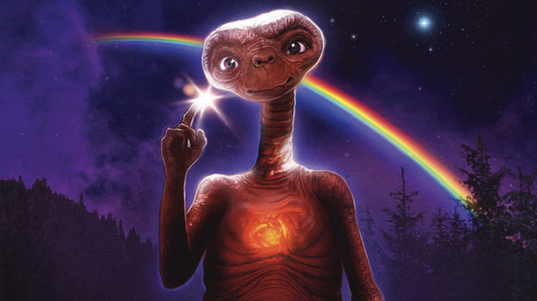
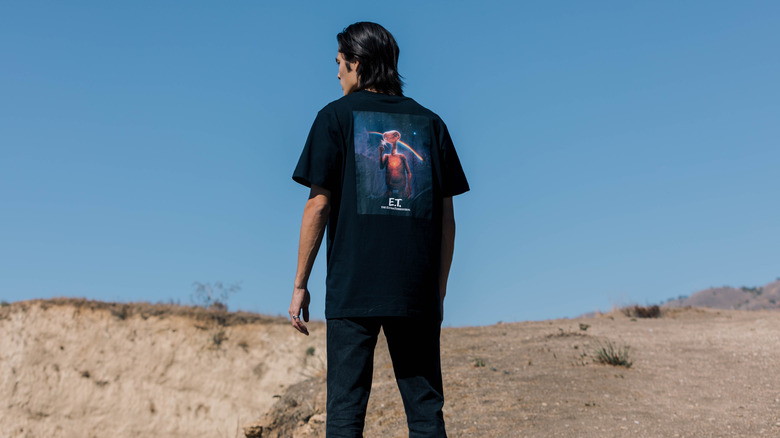
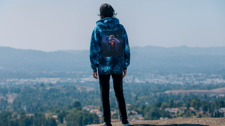
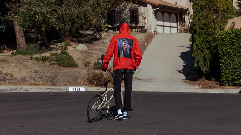
We're big fans of his around here, so when the opportunity arose to speak to him about one of his projects, we jumped at the chance. Shoe Palace commissioned Shipper to create a piece of original art for a new line of tees, hoodies, shorts, and pants inspired by Steven Spielberg's 1982 classic "E.T. The Extra-Terrestrial," and he delivered by creating what he says "might be one of the biggest E.T. images ever drawn." Here's our chat with him about his new artwork (which, as it turns out, is not as new as it once was).
This interview has been edited for brevity.
Using Nostalgia As A Tool
I know that you previously created some E.T.-related artwork for at least one Empire Magazine cover and for an Xfinity campaign. Having already worked on a character that is in some ways limited in terms of expressions and positions, did you find it challenging to do something different and avoid repeating yourself for this new collection?
My illustrative hero, Drew Struzan, is kind of synonymous with a lot of the older original E.T. illustration work, apart from the movie poster by John Alvin, which didn't really feature E.T.'s physical appearance. So Drew's work was synonymous with the character, and it might be one of the reasons I've been sought out, because my work is quite similar to Drew's in a way. It kind of has that feel of nostalgia, which I love and is the reason I've been fortunate enough to do this kind of stuff. But as far as creating the character with a new look, we wanted to do something that didn't exist before – recreating the forest background, and I really wanted to incorporate the rainbow effect. It just felt right. Kind of retro. And that part of the movie is always one that hits you right in the tears and the emotions – the music and everything at once when he's finally going home. This artwork was done in 2018 for Nice Kicks and Shoe Palace, but there's been so many delays that it's just been pushed back and pushed back. So in between doing that, the Xfinity job came along, so I got to revisit an official E.T. image again. It's like a little mini-sequel for the movie, that advertisement.
So you mentioned nostalgia, and that's an element that helps define a lot of your work. Is there a trick to imbuing an image with a nostalgic feeling? That's such an intellectual idea, so how do you translate that into something that's tactile?
It's trial and error, really, and being honest with yourself when you're working on something. You're constantly trying to look at it with fresh eyes to see if it's giving you the right feeling, and sometimes you can overwork things, but there's a moment that happens that's like, That's it. Got it. It feels right now. The layout or the colors or the finish, whatever it is. I'm constantly trying to recreate that feeling I would get seeing the work of people like Drew and Richard Amsel and Bob Peak, those kinds of artists. It always filled me with something when I would see a special piece of their work, so I just try to channel that feeling a little and take myself out of the equation and look at it from afar and think, Does this do it? Does this work? Sometimes it's real quick, and other times you really have to work at it. When you're working with other creative people as well, they have their own creative ideas, so you have to find a balance. Sometimes it works better than others, but for the most part, if you're on the same page, you get there and it's a real win when you get it right.
Making A Still Image Feel Alive
Did you find that there's a tiny thing about recreating E.T.'s likeness that makes all the difference? Like, if this one thing is slightly off, the whole thing feels wrong, but when it's right, the entire thing clicks into place?
Yeah, with E.T., there were a few things where if you were just slightly out, it went wrong. He's very unusual. If you get it slightly wrong, it just feels wrong. His eyes are really important, the wrinkles – everything about his look. When you look through the reference materials that Universal can provide you with, he can look really cute or he can look quite sinister in some images. It depends on angles and the way it's lit. But you want to try to give him the feeling of being alive. A lot of us understand how special effects work, and at the time he was a puppet [or a person wearing a costume], so to try to make him look alive in a still image can be quite difficult. You have to try to channel that – he's very cute and interesting looking, and you want to try to hit all of those things if you can. Like, if you flip the image of E.T., he looks wrong.
What were the early conversations you had about what kinds of feelings or emotions this imagery of E.T. should evoke?
When we talked about it initially, it was to try to have a new piece of artwork that still felt like it could possibly be from that time. Almost like it was hidden away in the archives. That was the initial idea. I wasn't sure how big they needed the artwork – it's a massive file, it might be one of the biggest E.T. images ever drawn – but it was just over the top big, so the detail is quite a lot.
Capturing The Life Force
Is there an essential component of the character that you wanted to highlight in this collection?
Mainly the life of the character, because his life-force is so important in the movie. The glint in his eye, the heart, the glowing of his chest: I really wanted to make that as right as possible. Obviously the magic finger. And the reflection on his face, I remember working on that for quite a while. Getting the proportions right of his body, his arms, and everything. He's a lovable being, but very unusual at the same time. Generally I don't usually do a single character on their own. I actually wanted to do more of a composite image with all the characters to get the sense of the entire movie, everything that went on and the magic of that. But they wanted me to concentrate on E.T. on his own, and that's why I wanted to have at least some kind of arc of the rainbow in there – that was trying to show an important element in the background. The music that John Williams did always gets me. I'm a huge soundtrack fan, and I listened to the music while working on this one. It gets you every time, the goosebumps – it's very effective. It's an absolute pleasure to work on E.T. I hope I did it justice.
The product line goes on sale on November 19, 2021.
Read this next: 20 Movies About Aliens That You Definitely Need To Watch
The post Artist Paul Shipper on Creating Original Art for a New Line of E.T.-Inspired Clothing [Interview] appeared first on /Film.


0 Comments