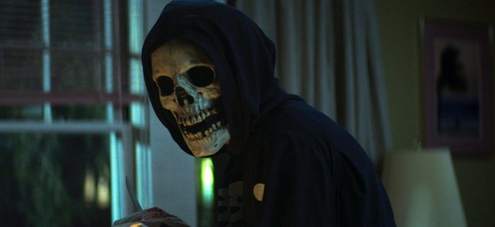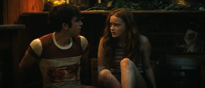
Netflix’s Fear Street trilogy was a massive undertaking. But for cinematographer Caleb Heymann, it was downright breezy compared to his current schedule for Stranger Things. But still, Heymann and the crew had a tall order to complete. The shoot lasted over 100 days and involved different period settings, a large ensemble, and three unique tones to capture. Although director Leigh Janiak‘s adaptation of R.L. Stine‘s work offers three distinct experiences, they’re all of the same piece. And it was Heymann’s job to convey that visually.
We recently spoke with Heymann about shooting Fear Street, and how they pulled the whole thing off.
What was the production schedule like for Fear Street?
Initially, I was brought on to do one and three, and both with Leigh directing. Initially, there was going to be a different director for part two. The whole thing was planned as a 106-day shoot. With movies one and three, Leigh and I were going to do 68 days. Then, things didn’t work out with the other team that was going to do movie two.
Halfway through the production, Leigh and I found out we were going to do another movie after we shot parts one and three. It was essentially planned as one big production. The idea was to consolidate and not completely cross-board the schedules. We didn’t have a ton of prep. For me, it was six weeks, which would’ve been nice for one movie.
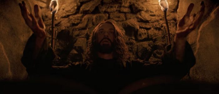
We went into shooting part one and the end of movie three as it roundtrips back as one big block. It was, I think, 46 days. It was crazy we finished it on a Monday. Literally, the next morning on Tuesday, we were shooting again. Suddenly, we were in the world of 1666. The production designer Scott Kuzio and art director, Sean Brennan, did an incredible job building this village out in the middle of nowhere.
It was shocking to everyone to make that transition overnight from this UV lit mall to, in the next morning, a field with goats, horses, torches, and no artificial light motivation. From the get-go, that was how it was planned on how to keep the momentum of the crew going.
We plowed straight through the world of 1666. It was probably another five weeks of shooting. We were in the village for around a month. When we started there, we thought we were done. We quickly found out we’d be shooting a whole other movie after that. There were rewrites happening with that. We had very minimal prep time for 1978. The original plan was another team would prep it while we were shooting 1666. Of course, we were that team.
We had to basically have this minimal hiatus which allowed everyone to catch their breath. We had less than two weeks to quickly prep, which was not even enough time to properly shot list. It was, like, let’s read the script as quickly as we can, get a sense of what we’re going for aesthetically, and let’s wrap our minds around the locations. Besides what’s on stage, a lot of it was on location at the summer camp, which was our saving grace. In our back pocket, we had the 1666 film, which helped us in that we were handheld, could move quickly, and adapt without much prep time.
For the second film, we were exhausted, but dialed in, creatively, to allow us to go in and shoot it. Sometimes there’s a bit of excitement and freedom to that where you’re kind of reacting a lot to what you’re seeing with the blocking on the day. We knew we had certain touchstones for ’70s filmmaking. We had two phenomenal steadicam operators, Nick Müller and Brandon Thompson. It’s quite unusual to have two steadicams, but we knew we needed to move fast.
The steadicam was invented two years before 1978, so we were like, “Yes! True to the technology!” It was quite fun. Obviously, we brought in zooms. Sorry, long-winded, but it was 106 days and we concluded with 1978.

Obviously, it’s all of a piece, but you do get three very different horror movies. For you, what makes them visually coherent?
I think there are a lot of differences that are inherent that we could talk about, but it is interesting to think about what makes them coherent, aesthetically. I think a lot of that comes from Leigh Janiak, her preferences, aesthetic, and love for moving the camera. We do a lot of expressive camera movements. We both like being physically close to the characters with the camera and with wider lenses. We used the same set of anamorphic lenses throughout but had them tuned to different periods. You’d have the same focal length for close-ups, but a subtle different tuning of it that allowed for subtle parameters to be controlled. There is a logic to the focal length.
We had our possession lenses, which were these weird Russian portrait lenses with these custom anamorphic elements added to them. We would use them for certain possession moments when the witch is grabbing hold. We generally avoided longer focal lengths, but for the ’70s film, we did it a little more. We brought in more zooms, too, because that felt more ’70s.
Generally, for Leigh, a lot of compositions are in the middle. There’s the fast pace of the edit, too. It’s meant to be immersive filmmaking that I think is very effective for the characters’ emotions. I think the lighting styles are very different, but I was always going for something rich in tone and contrast with each shadow, no matter where we were. We wanted the shadows to feel dangerous, that evil was lurking.
We already talked about the bread slicer scene, but the grocery store scene was one of the craziest weeks of production, right?
I think we did 68 setups on a Friday, which was one of the craziest days I’ve ever filmed. We brought in an extra camera. We were spread out and shooting simultaneously in three different parts of the grocery store. Basically, we had to finish up on Friday. The store was opening back up the next week. It was a mad scramble to the finish line. Sometimes you just do what you have to do.
We were so excited things came together in the edit. It’s hard when you’re shooting that spread out. With the lobster scene, we had an actual lobster tank on a stage later. The underwater stuff was inserts we got later on at a stage. Everything else we finished at the grocery store. It’s maybe a 15 minute stretch of the film shot during that five-day week.
It’s one of those things where you look at the location and think, how are we going to make this big white box store visually interesting? Like the mall, we switched off all the overhead lights and built these pockets of color that differentiate different themes and parts of the store.
The film was already leaning into this over-the-top, sort of garish color palette meant to juxtapose with the other films. As you go back in time, it gets dialed back. We wanted 1994 to be this explosion of color. So, it goes from the pharmacy area with the warm light initially. Then, we switched out all the practical lights with RGB and LED strips, so we can dim them down and control them. We didn’t want a boring white color, but a funky, florescent sienna color as a base.
With the whole Deena and Sam storyline, I always tried to use a contrast of warm and cool light. It was a visual motif that I was trying to pursue. This scene kind of reaches, I’d say, the color climax, in a way. You get this extreme pink against this extreme neon blue. They are motivated by the seafood sign, which was lucky. It tied together with the visual motif of the warm and cool where their storyline reaches a climax with Sam’s death. Then, we decided to throw in some good flickering lights on the day. We thought it’d be a cool punctuation to Sam’s death.
Going from that to more natural light in 1666, how was that? For example, how were the torches as light sources?
They were beautiful light sources to shoot with. I mean, it’s a big flame. We’d have scenes with dozens of torches. The actual torches create a beautiful key light on the actors’ faces. A candle is actual quite a hard light source, but a good torch is a nice, big, and soft key light for whoever is carrying it. With the ALEXA, it holds the light so beautifully. We weren’t ever close to burning them out, but with some cameras, you might struggle to hold the highlight information.
We always had this base of beautiful ambient moonlight to use, which was provided by this big old 40-by-40 foot moon box that gets hung over the set with a construction crane. You can dim it down, too. There’s always the soft ambient moonlight that helps you, so you’re not entirely relying on those lanterns. It creates a beautiful, soft color in the frame. I’d say those moments were some of my favorite lighting effects in the film. I’d say, my favorite lighting effects in the trilogy comes from the torches.

What were some of your visual references for the trilogy?
You read the script and instantly know Scream is a huge one, of course. I remember sneaking into the theater to watch it when I was 14 or 15. It has such a visceral thrill to it. It was wanting to recapture the fun and excitement that came with that experience. I watched it again, of course, and the way the camera moved with steadicam and anamorphic lenses, it’s just a more classic ’90s cinematic look we were after. As far as moving the camera, we wanted sparing use of handheld, dollies, technocranes, and a lot of steadicam. It would allow us the juxtaposition for 1666 when we went fully handheld.
When Leigh and I first sat down, Leigh mentioned The New World and The Knick. I had never seen The Knick, but it’s incredible the way the camera freely moves around the spaces. For 1666, we were lighting spaces to give us the maximum flexibility to search for more unusual compositions. You keep that in mind as a cinematographer. Obviously, you have your own preferences for the lighting tools you like and compositions that appeal to you. Fortunately, a lot of the same preferences I had lined up with our production designer’s preferences. We were lucky to be in alignment when it came to that.
For the ’70s film, we have films like Halloween, which we really wanted to reference. I know I wanted to get the swinging lightbulb in there somewhere [Laughs]. Once you know what you’re going for and wanting to capture some of the golden tonality of the films of the ’70s that I love, you also want dark shadows at the same time. Even on a sunny day, you want danger lurking. You know, there were elements of The Godfather and Badlands as far the look as I was after for the ’70s. With Halloween, you got the harder shadows and cold moonlight.
Once you’re making it, these things are subconscious. It’s not that premeditated. You’re just having to make so many decisions per day, you’re kind of responding to what the actors are doing. You have a base of a plan, but hopefully, you’re staying true to what you set out to do as this production becomes a giant freight train, there’s no stopping, and everyone is holding on for dear life.
***
All three Fear Street movies are streaming on Netflix.
The post How ‘Fear Street’ Cinematographer Caleb Heymann Tied All Three Movies Together [Interview] appeared first on /Film.
0 Comments